Welcome to Provincial Coldstores in Blenheim
We provide comprehensive storage facilities to keep your goods in the optimal environment, be it frozen, chilled, ambient, or controlled temperature.
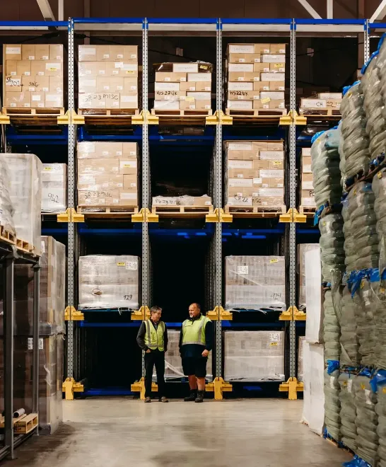
For more than three decades, our focus has been on providing efficient, cost-effective storage solutions to premium export producers across New Zealand.
We know that there’s no room for less than optimal quality when it comes to export products. As such, our Old Renwick Road site in Marlborough is Ministry for Primary Industries certified, meeting New Zealand and International food safety requirements.
We offer frozen, chilled, ambient and controlled temperature storage options with a temperature range of -25°C to +30°C across two sites handy to regional transport hubs for national and international dispatch.
Our cold storage facilities are fully licensed to store all types of meat, seafood, dairy, fruit, honey, wine and viticulture products. We also cater for many other unusual products of all volumes. We would be happy to provide a solution for yours, please enquire.
Our specialised services include:


Alongside our purpose-designed facilities, our experienced, specialist team takes care in providing a quality, friendly service. Get in touch to discuss your storage needs.
QUALITY ASSURANCE
Our clients have strict export standards to uphold, so that means we do too. It’s important for us to protect our producers and consumers.
We’re an approved transitional facility with meticulous systems, as recommended by MPI, across both our sites. Our personnel are highly educated around current regulations.
Our certifications include:
- New Zealand Customs approved storage
- New Zealand Customs Secure Export Scheme
- Approved EU, USA and China storage facility
- New Zealand biosecurity transitional facility for the unloading of imported containers
Find more information about MPI’s regulations here.
Find more information about NZ Biosecurity Certification here.